Posts

Showing posts from 2013

WTP

Image
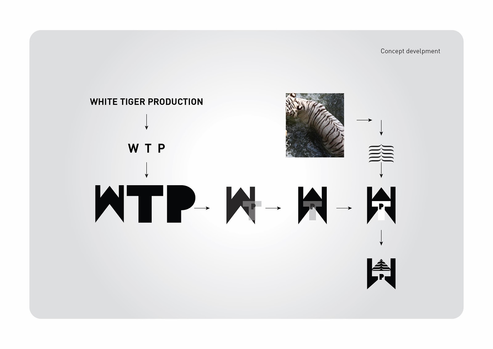
    Concept is a formed by merging three words to one, that is White Tiger Productions to WTP. The logo used for fourth concept is entirely different from previous ones with new idea. In WTP, the  “W”  represents two pillars, which explains the strength of White Tigers. In the White Tiger Logo you can see a  “T”  shaped structure, in between, which explains a shadow of light passing through or like a light passing through an open window. In the center of logo you can see a  “P” , it’s a door of creativity, and all above a roof like structure is created, here it is created with a concept of backbone stripes of white tiger, which explains that White Tiger is our powerful strength.   Totally the logo looks of production house. As above said the ultimate colors used are black and white, because it represents the White Tiger. Very simple and cute typography is used. As the brand mark is shown in big and strong in size, the t

Dec: 25 Red Wine for X’mas Special

Image
Brand: December 25 Red Wine for X’mas Special   The briefing (in brief):  “ We need a logo and bottle design for out wines” ".   The target audience: Consumers with respect for pure products in foreign markets (Europe)   The design: Excellence is always the flavor, which locks our taste. Wine production has a rich family tradition which is still followed all over the world.       The design of the logo is created like with small grapes fruits in shape of a Christmas [x’mas] tree, it is beautifully showed with the grapes leaves and grape Tendrils, like a welcoming waves of flavors. On the top of logo design we can see a happy reindeer, which shows the X’mas celebrations.  Elegant typography is used to design the logo.   The name December 25 is shortens to Dec: 25 Red Wine.   Dec: 25 Red Wine was founded in the year of 2000, from the time of beginning itself they were concentrated in production of red wines only. Dec: 25 Red Wine

AOD - Talent hunt

Image

AOD – An Opened Door

Image
AOD – An Opened Door The briefing (In brief):  “We want simple logo, where the subdivisions of company can be incorporated. All the subdivision logo designs should be connected with base of mother brand. The target audience:  Customers with respect of quality services The design:  AOD is a mother company, having lots of subdivisions, at initial stage only three sections are been started. They are named as: AOD Talent Hunt AOD  Sign & Graphics AOD  Kitchen Galleria As per client request, each subdivision was given their own suitable colors. On Making:  In order to avoid mistakes and also as per the request of client we followed only one color “black”, for the mother company,  because in subdivisions, there will be a chance of arising other various colors. The word An Opened Door is shorted to AOD. Here different types of shapes are being used such as Round, Rectangular, Triangle, and Square and