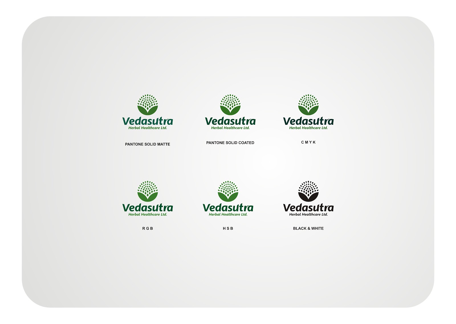
VEDASUTRA


In this logo we can see two different shapes one is ‘V’
shaped structure and other is a tree shaped structure. These two shaped
structures’ are more closely related to Ayurveda.
‘V’ represents leafs and combination of leafs represents
tree. A strong typography is used and it is more attractive and which
represents the product quality and shows company strengths. Trees and human
kinds have always had a symbiotic relationship throughout the centuries.
They provide us with fruits, flowers and medicines and trees
have long life. Our products are similar to tree therefore we can say our
products have long lasting quality. Here the structure of tree is a combination
of leafs, it represents like leafs in air which feels like a breathing oxygen.
Only one single colour is used for this logo
that is green colour which increases the beauty for this logo. Green is the colour
of nature, life, attractive beauty and it’s a restful colour and refreshing
too. Green colour symbolized self - respect and well being. Green is the colour
of balance of nature also. Here the colour green is related to nature and more
closely related to life, Ayurveda, Herbals and Healthcare products.
The Vedasutra signature is thus formed from the two main
elements, the Vedasutra symbol and the Vedasutra custom-drawn logo type. The
placement and alignment of both the elements add dimension and depth to the
signature. These elements are closely related to natural herbs, plants and
trees which form the vital source of Ayurveda.
The signature is executed considering one’s
responsibility towards the balance of nature using only the purest natural
ingredients free from modern day genetics and chemicals ensuring purity, trust
and sustainability. The signature displays and image to the world that is
strong and pure.


Comments