Posts

Showing posts from October, 2012

HR Conference

Image
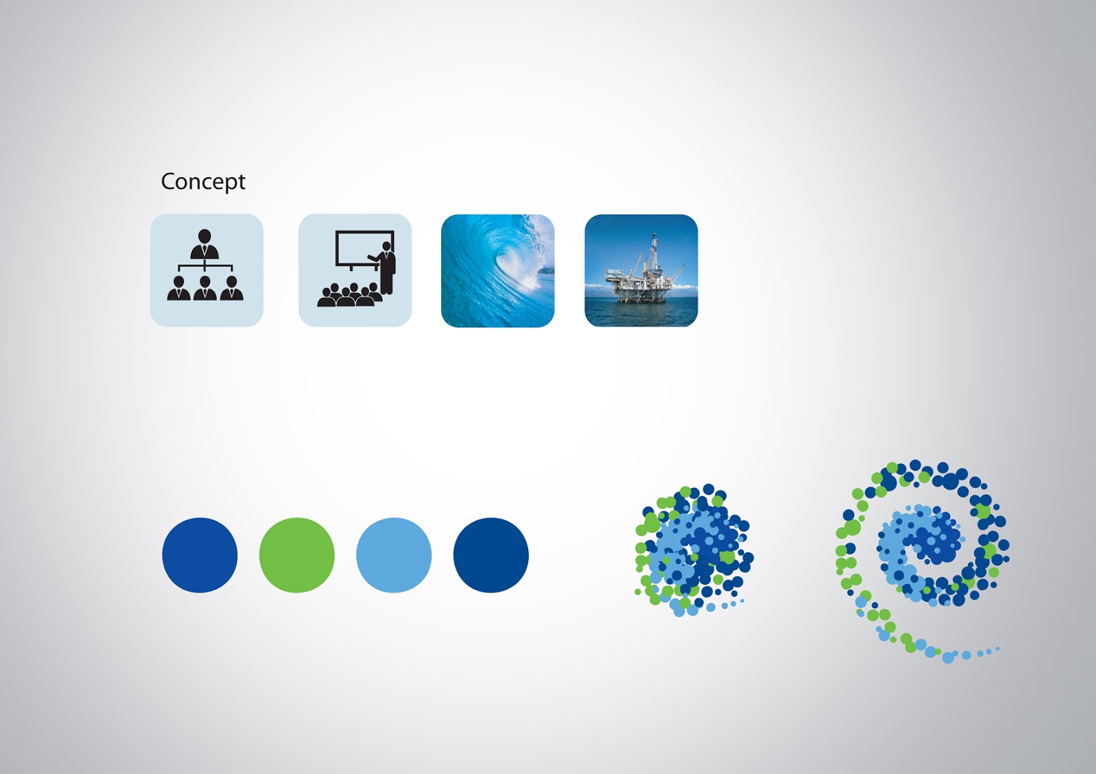
KJO represents the second HR conference - 2012. The logo identity was created by keeping in mind the global aspect of HR conference, where people gather together to discuss various aspects of the company. The element “spot” used as a symbolic representation of people here. Several spots of different size has been graphically placed to form the swirl of the logo. The swirl shape moving in one direction forms a strong force adding motion to the logo, like how people gather in for a HR conference. The swirl also resembles the circular motion of the ocean at the time of drilling. The color used are blue, light blue and green which is the corporate color of KJO the logo signs off with the tag line “ KJO Human Capital... Fortune for The Future ” which leads credibility to the purpose of the conference.

Discovery

Image

HRSP

Image
HRSP-2011 is KJO’s latest initiative to communicate the HR Department’s existing and emerging practices and concepts. The series of seminars is aimed at creating awareness among KJO employees of global trends and the role of HR both professionally and personally. We have developed a theme for HRSP-2011 that encompasses its events and topics into one single theme message “Evolution of HR in the New Corporate Order”. This message not only highlights the importance of HR, but speaks of how HR is transforming itself as a strategic partner and technology-centric interface between management and employees. The theme logo is created using diametrically opposite circles, interweaves to form Partnerships. These four circles also give out the desired Integration between HR and the community. The resulting intersection points have the characteristics of the KJO brand mark. The light and dark blue colors are KJO corporate colors.

Inaugural Invitation & Gift box - Honeywell

Image
The invitation for the inaugural ceremony has been designed keeping in mind the many VIPs and senior dignitaries who will be among the guest list. By sheer design and contents, each invitee will be tempted to retain it – an advantage for Honeywell for its brand recall. Dressed in Honeywell corporate colors, the outer cover looks deceptively simple. When the cover is opened, the invitee will be pleasantly surprised to find an actual “Bow Tie” (again in Red) to represent the corporate and formal experience of the event. This special gift is also a gesture of Honeywell’s gratitude to grace the event. The gift is accompanied by a written invitation to attend the event. This invitation with the Bow Tie will only be presented to men, while women will find a special edition ‘Brooch’. The invitation will be designed using special paper with the words ‘Invitation’ embossed on the cover.

IT SAFET BOOK

Image

BOD - Conference

Image
Concept - Aiming Higher: Saudi Aramco is proud of its heritage, its culture and its attitude that enables the organization to live up to its reputation as the global leader in oil and petroleum. As any global leader, its prerogative has always been to foster strong relationships between corporates, governments and the global community. As the organization explores emerging markets and continues to invest in fuels that sustain global environments, it is forever ‘aiming higher’ to attain its objectives. ‘Aiming Higher’ hence is an expression of Saudi Aramco’s quest to explore, innovate and deliver quality. The Board of Directors’ meet in Japan – a country known for its culture and tradition, in as much as Saudi Arabia values its islamic principles, is an exercise to announce to world of its plans for the future. In keeping with the theme ‘Aiming Higher’, the following presentation makes effective of the ‘Temari Ball’ as a means to signify the meeting point of two extremely