WTP
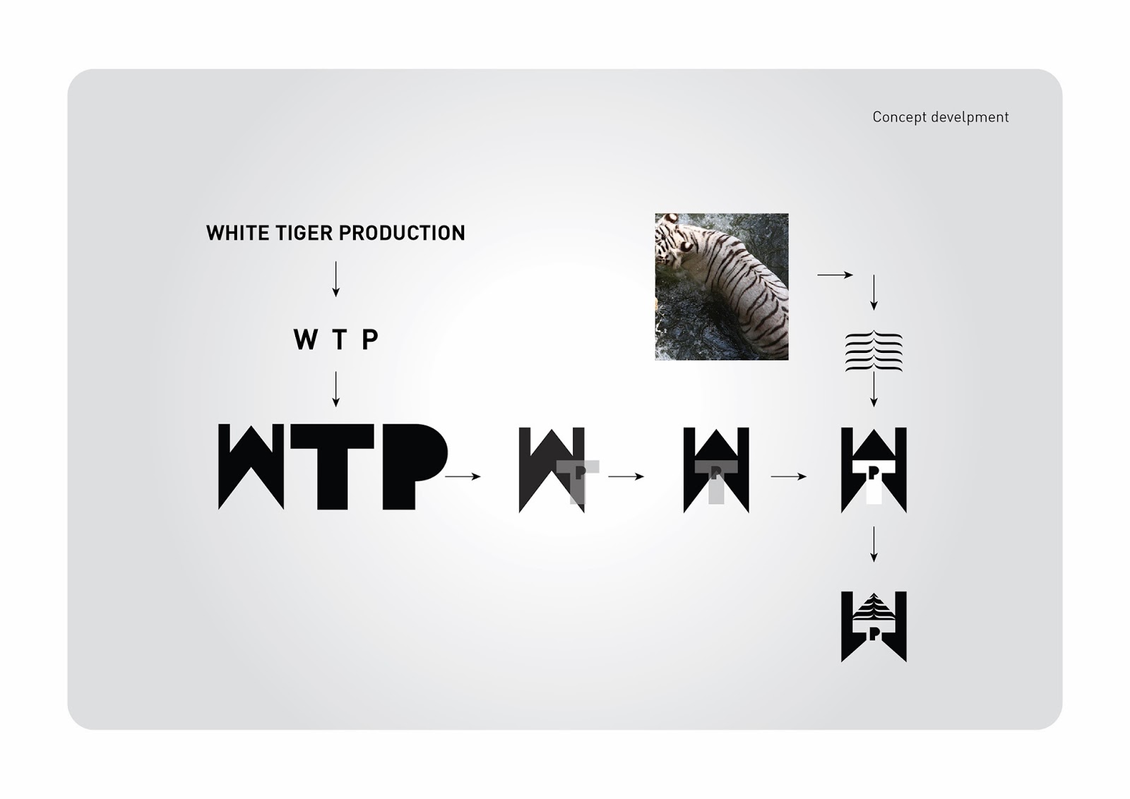


Concept is a formed by merging three words to one, that is White Tiger Productions to WTP. The logo used for fourth concept is entirely different from previous ones with new idea. In WTP, the “W” represents two pillars, which explains the strength of White Tigers. In the White Tiger Logo you can see a “T” shaped structure, in between, which explains a shadow of light passing through or like a light passing through an open window. In the center of logo you can see a “P”, it’s a door of creativity, and all above a roof like structure is created, here it is created with a concept of backbone stripes of white tiger, which explains that White Tiger is our powerful strength.
Totally the logo looks of production house. As above said the ultimate colors used are black and white, because it represents the White Tiger. Very simple and cute typography is used. As the brand mark is shown in big and strong in size, the typography is created in a elegant manner.
The logo can be used in any platforms, it is easy and more comfortable to use and it is readable at any distance. The brand mark can be fixed very easily, means it is easily adaptable.
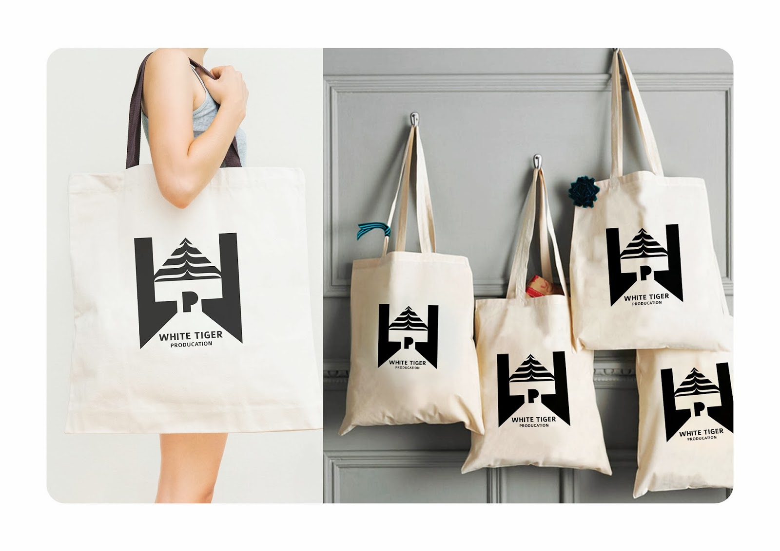
With the WTP brand mark an identity design pattern is created. Those patterns are used in stationeries and can be used anywhere needed. In stationeries there are business cards, letter cards and envelope etc, etc.,
This project is a proposed design only
Business cards:
A new concept is done for these business cards. The design patterns are given in the reverse side of business cards by adding some new forms in a new way to greet with surprises such as “hello, hi, Namaste, hey, hola, hi dude, wassup, hiya” etc are added with vibrant colors. The concepts used here in business cards are very young, stylish and easily catchable by everyone.
Letterheads:
A new concept is done for these letterheads too. The design patterns are also given in the reverse side of letterheads, with vibrant colors with striking words. Here I used” Credentials” which means documents. If this word is to be changed it can be according to your tastes.
Envelope:
New concept is done for this envelope too. The design patterns are also given in the reverse side of envelop, with vibrant colors with the word, Handover.
Here the stationeries designs are different from normal stationeries. It is more trendy and colorful. In this concept numerous colors are used.


Comments