CANAR
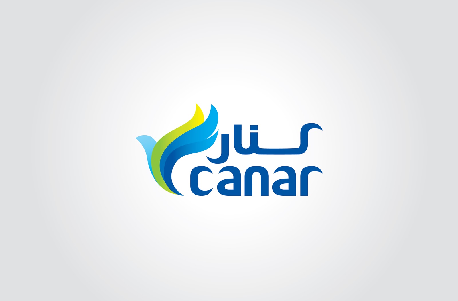


CAÑAR is a prominent member of the Office Automation
industry and therefore, the design reflects the industry CANAR operates in. The
difference lies in the elimination of sharp edges to offer a seamless design
that agrees with CANARs deliverance of seamless IT solutions. A clear winner in
our internal brand audit poll conducted among people of different languages and
backgrounds, this option clearly translates CANARs desire to form long term
partnerships with customers and help them succeed in their businesses. The four
shapes that make up the bird is a reflection of CANARs 4 core product
differentiators (IT Division | Office Automation | GIS and Geo Services |
Supplies & Consumables).
• This logo
should be simple and readable.
• This logo should convey a sense of
emotion and personality. As you delve deeper -the typography,
the symbols, the
shapes and textures, and color palette - you learn more and more about the
brand
(the company) behind the logo.
• This logo should express the
appropriate tone and voice articulated in your brand strategy.
• This logo should be flexible and work
well in a multi-channel sales environment.
• Your logo should
look different from other logos.


Comments